Are you starting a new business? Need a logo that accurately represents your brand? Before I tell you how to design a logo, I should say logo designing is a long and slightly complicated process. Therefore, if you have the means and resources and don’t want to go through the hassle of designing and making your own logo- outsource. Our experts here at Polyuno are brilliant logo designers, and most importantly, you will get what you pay for, which is the best.
That said, if hiring a designer isn’t in the cards for you, this article is a comprehensive guide on the basics of how to design a logo.
A logo is something recognizable. Logos are your brand’s identity. People look at a logo for your brand, and they get a sense of what you represent. Logos are what your customers remember your business by. They can be large and colorful or small and minimalistic. It all depends on what your business is, what message you are trying to send.
Your logo is your chance to make a statement about your business. Let’s take the Toyota logo, for example.
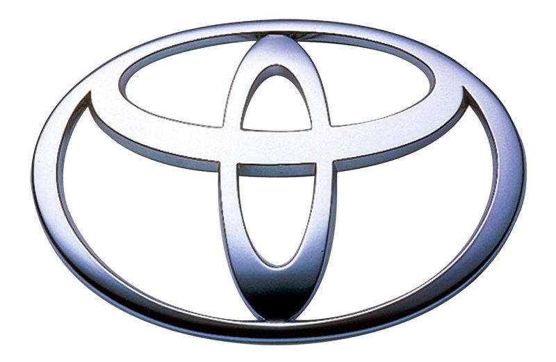
Do you know what the famous ovals in the logo represent? The two perpendicular ovals inside the larger oval symbolize both the customer’s heart and the company’s heart. The ovals then overlap to showcase the mutually beneficial relationship that exists between the two. To add to it, the ovals together form a T shape indicating the name of the company. Whew! Who knew there was so much meaning behind something so simple? But wait, it doesn’t end there. The curved edges of the logo convey sophistication and sleekness. Simultaneously, the typeface is bold and striking, implying strength and dependability, while the metallic shine adds a feeling of high value and quality.
However, most companies struggle with their logo design because they simply ask for too much. While it is great when a logo (much like Toyota’s) conveys so much meaning, that doesn’t always have to be the case.
Sure, your logo represents your brand, but it isn’t the entire brand. Your brand is something intangible. It encompasses everything- from the product you sell to how you sell it. It is your business reputation. Your brand is whatever emotion people feel when they hear its name. Your logo is just one of the many tools you can use to deliver your brand message and invoke that said feeling in your customers.
The same way Toyota uses the curved thick silver font to convey its message of being dependable but luxurious simultaneously, your logo isn’t just a picture or your visual identity. A logo is a part of the bigger picture.
Apple is the only trillion-dollar company in existence, yet its logo is a simple black half-eaten apple. Your logo is no indicator of how successful your business is. A simple logo doesn’t mean a failing business, and a complicated one doesn’t symbolize a booming one.
Now that we know what a logo is and isn’t, let us get on to answering the question of how to design a logo. For easier understanding, the process of logo designing and making has been divided into four phases-
Your logo conveys your brand message. For it to successfully do so, you need to understand what your brand message is. People want to feel a connection to the product you’re trying to sell. They want to relate to it. There are specific techniques you can use to understand your brand better-
Sit down with a pen and paper and start noting down words that describe your brand. Then use short, precise words to describe the unique characteristics of your business. What sets it apart from its competitor? Why does it stand out in the market that it operates in?
The saying “Know thy enemy” is significant in the business world. How can you outshine your competitors if you don’t know what they are doing? Conduct thorough market research and look into logos used by your competitors. Divide the competitors’ logos into two categories- ones you like and ones that you don’t. Now have a good starting point on figuring out what your logo should and shouldn’t look like. It’ll also help ensure that your logo is different from your competitors’.
Its delivery channels heavily influence logo design. If you intend to use your logo on t-shirts and billboards, you must design your logo a certain way. If you only plan to use the logo through digital mediums, then the logo needs to be designed differently. Think about delivery channels, uses, and applications for your logo when designing it.
And then ask yourself questions such as-
Now that you know enough about your brand to have a tentative idea of what your logo should look like, it’s time to get to the actual designing part. If all of this seems too much, you can always contact us at Polyuno. Our experienced team of designers can design a logo for you.
While the quality of a logo may be subjective, most well-liked logos have particular characteristics and features.
Some of the best logos of all time are simple, unique, memorable, versatile, and fit for the industry and target market your business is serving. They should also be readily recognizable and represent the brand.
In contrast, a bad logo is often a rendition of another famous logo, which can confuse your customers. It is also vague, meaning the customer will have difficulty figuring out what the company is and what it does.
Visual hierarchy dictates your focal point. When you look at a logo, what is the first thing you notice? Visual hierarchy helps guide you through all the information that the logo gives, from the image to the shapes, color, and text.
When deciding on a design for your logo, you can consider going for some of these common types of logos-
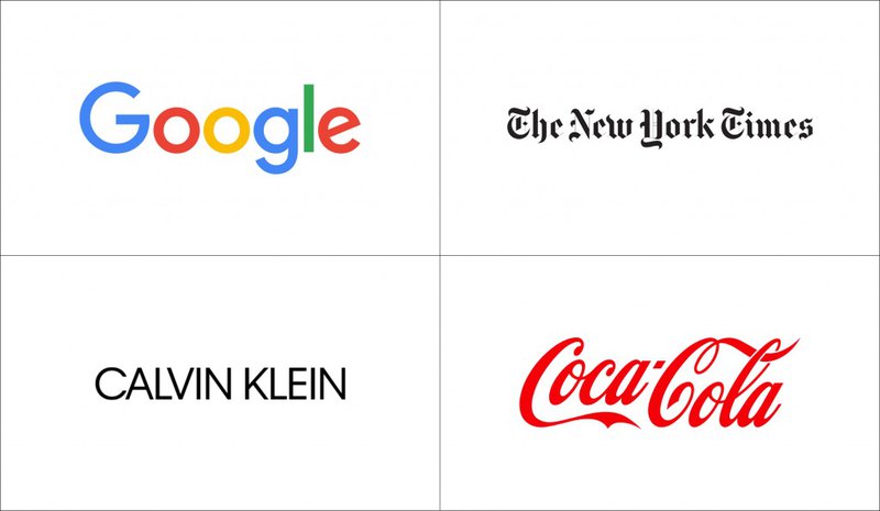
Wordmarks are the most commonly used and simple type of logo. Designers often refer to wordmark logos as a logotype. They are very straightforward looking and only use bold font to tell the name of your company. Wordmark logos work best if your company name is simple, easy to pronounce, and uses no slogans.
Also known as a letter mark, a monogram logo is made up of just letters usually made up of the company name’s initials. The monogram usually acts as a symbol in the logo with the company name stated below it.
Combination logos are, well, a combination of a symbol and a wordmark. This is a more traditional form of logo. It is easily recognizable because it uses a combination of two common design elements. Another plus point of using a combination logo is that depending upon the purpose, and you can use the symbol and the text separately.
Brandmarks or pictorial marks are the graphic symbols in a logo. Brandmarks are symbols that are readily recognized by the audience. The customer can form an immediate connection—a plane for a tourism company, a tooth for a dentist, etc. Initially, you need to combine the brandmark with your company name till your company has grown to the point where the brandmark is impactful on its own.
Abstract mark logo feature symbols that are often geometric and possess no direct connection to the brand they represent; for example- the logo for Pepsi. They add a certain uniqueness to your brand, and once your company is famous enough, abstract mark logos can go solo.
The KFC logo is the most real and famous example of a mascot logo. Mascots make great logos because you can change the mascot’s expressions depending on the situation. They also add an element of fun, provided “fun” aligns with your brand image.
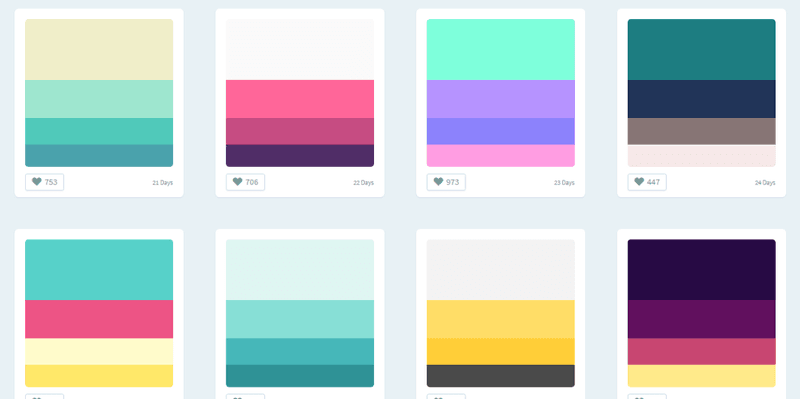
Choosing the right color scheme is imperative. The right color scheme isn’t just about selecting aesthetics. You also need to consider factors such as audience perception and your brand image.
Different colors invoke different feelings, so you must decide what kind of feels you want people to associate with your brand.
For example- The color green is often associated with feelings of peace and serenity and is commonly used to emphasize a connection to the outdoors. Conversely, red color is usually treated as a masculine color and is associated with ambition and confidence. To learn more about colors and the emotion they evoke, you can check out this article from E-learning Industry.
Choosing a color scheme isn’t limited to aesthetics and connections. Always be sure to have logo color variations for both dark and light backgrounds. Pick a versatile color that would look good in both light and dark backgrounds. The easiest way to ensure this is to make samples (t-shirts, website headers, letterheads, etc.) and see which color scheme works best.
There is no limit to how many colors you can use in your logo. Apple’s logo is solid black, whereas Google’s logo has an array of colors. Just go for whatever is the most accurate representation of your brand image and looks best.
Fonts are essential in logo-designing, especially when deciding to go for a Wordmark or a Monogram Logo. There are thousands of different fonts for you to pick and choose from. Each font, much like each color scheme, carries a different message. Let’s look at a few commonly used logo fonts and the meaning behind them.
Fonts with a little extension or a “feet” as shown in the diagram below, are known as Serif fonts. They are considered high-end, timeless, classic fonts. Logos that use Serif fonts have brands that carry the same messages.
Times New Roman is the most commonly used and famous serif font. It is usually used when the target market for a brand is the older generation. For example- Tifanny & Co. The luxury jewelry store uses a Serif font as a nod to the luxurious, expensive and timeless pieces it sells.
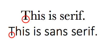
As indicated in the diagram above, unlike serif fonts, sans-serif fonts have no feet. They give off a more modern and contemporary look. Sans serif fonts are the preferred font for digital media content because they’re simpler to read.
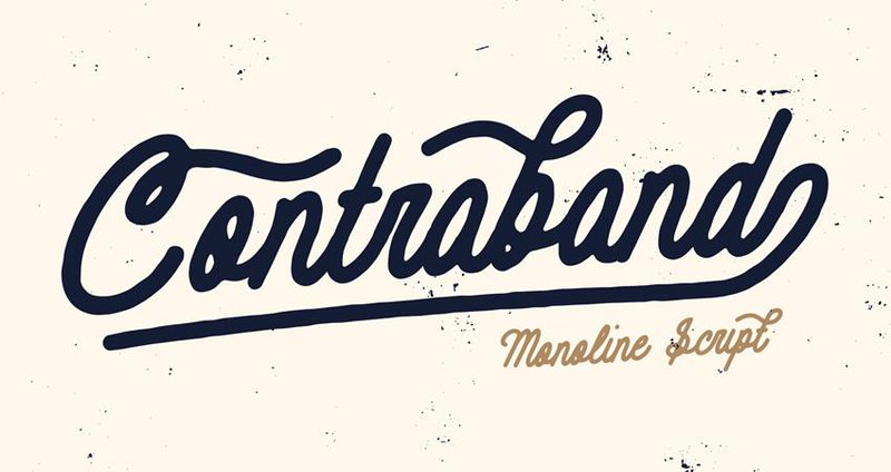
Script or handwritten fonts add a lot of flair and personality to a logo. They can look edgy, formal, and feminine at the same time. Successfully pulling off this font in a logo is difficult because you need to maintain aesthetics while ensuring the words are legible.
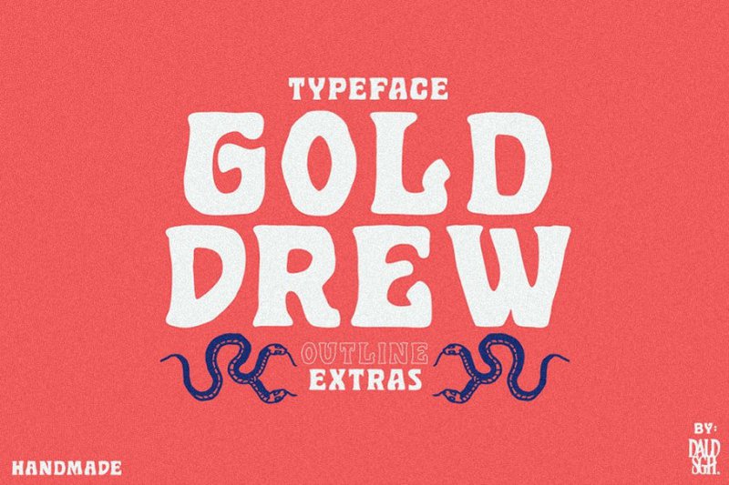
Display fonts are unique, broad category family of fonts that create a visual impact. They can be fun and make your logo look trendy and edgy. But make sure only to use this font family if it goes with your brand image.
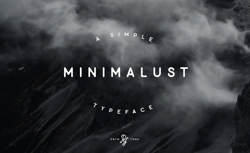
Modern fonts are elegant sans-serif fonts. They portray sophistication and minimalism and are used when targeting the younger demographic.
You don’t have to choose a font that already exists. You completely customize fonts for your logo. The main goal behind selecting the right font is making sure it’s legible, looks good on digital and print media, and meets your brand image.
Symbols are another design element you can incorporate into your logo design. Symbols can be literal and pictorial or abstract and geometric. Here are a few tips and tricks on how to integrate symbols into your logo design-
The shape and arrangement of your logo play a vital role in the overall aesthetics and look.
Shapes can either be used as containers or symbols in logos.

A container can be defined as a border that neatly outlines the area covered by the logo. While containers are a great way to add interest to your logo, they often cause scalability issues.
Here are a few common logo shapes along with a few design tips about each-
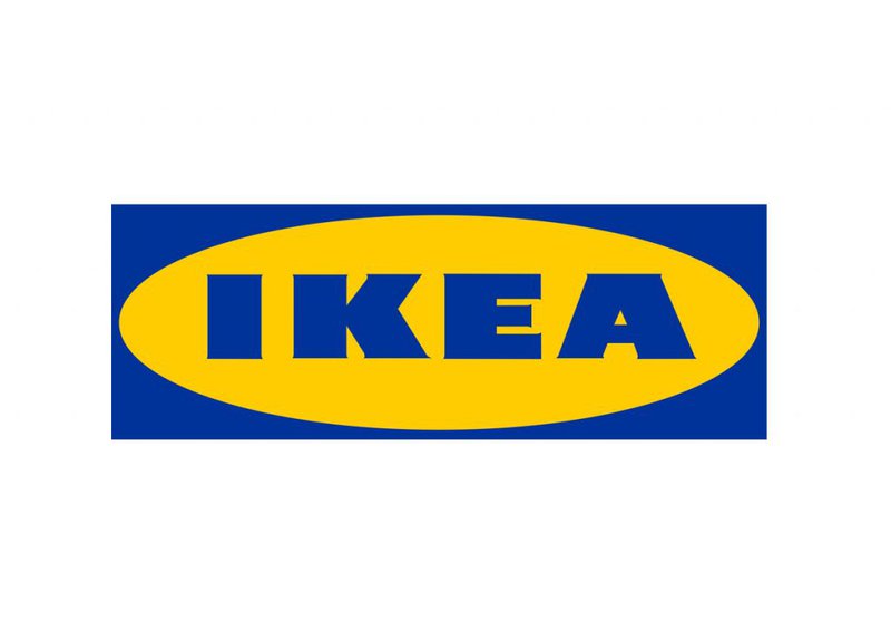
Squares and rectangles are said to convey feelings of stability and balance. Their natural symmetry helps calm the human mind and is usually used for companies with long names.

Circles represent security, unity, and protection. They work best with short names or monograms and can easily be scaled up or down.

Triangles are considered an odd logo shape, and people often associate them with strength, conflict, and speed. They are often used as a substitute for the letters A, V, and W.
Vertical lines convey feelings of aggression, courage, strength, and dominance, whereas horizontal shapes take on a more serene and tranquil quality.
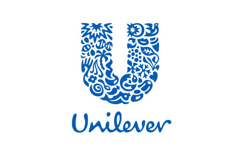
Less geometric in nature, organic shapes can give off whatever feel you want them to. It all depends on your design.
There are several layouts you can arrange the elements of your logo into. We’ve mentioned some of the more common ones below-

Words are vertically stacked on top of each other. The layout is often paired with horizontal lettering to add to the logo’s overall look with a symbol or picture placed on one side. This layout is preferable when the words used in your logo are all of the same lengths.
The placement of a symbol on a logo can be pivotal for the overall look. If you’re using a symbol in your logo, make sure to consider all options and see which placement feels the best for your brand and logo usage.

If your company has a slogan and intends to use it in your logo, place it after careful consideration. But it almost always appears below the company name.
Now you know the basics of the design elements involved in a logo. You can sit down, put together everything you have learned thus far and design your logo. Once again, if all of this feels too complicated, you can reach out to us at Polyuno. Our designers will ensure you get your money’s worth.
Start your initial designing endeavors on a piece of paper so that you can easily make necessary changes. Even if you think you aren’t that good at drawing, a few rough sketches will kick your brain into motion and get your creative juices flowing.
There are four main routes you can take to make your logo-

Hire a designer (like the ones we have here at Polyuno) to create your logo from scratch. You’d provide the designer with your vision and relevant guidelines- what you want it to look like and what you don’t want it to look like, etc. The designer will work with the given guidelines to come up with a design that satisfies you. This option may be a little pricey, but it is quick and worth the money!

If you have experience using programs available in the Adobe Suite (Illustrator and Photoshop) and have a creative flair, you can attempt to design the logo yourself. From scratch. The information in this article should equip you with enough information to create a memorable logo. Plus, using your own tools gives a lot of creative leeway design-wise.
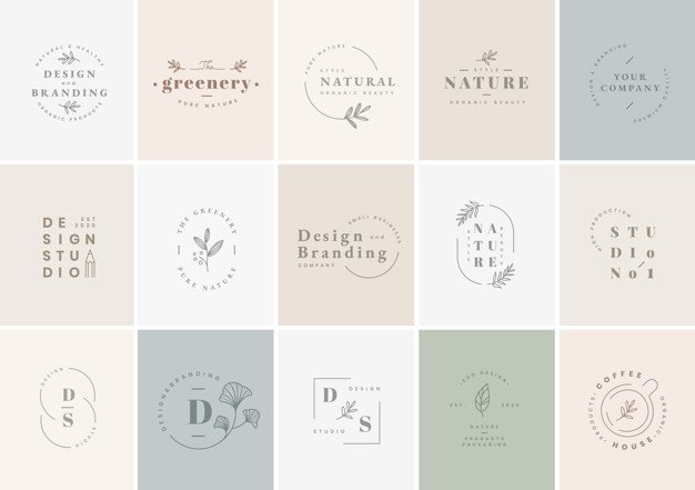
There are multiple websites where you can find pre-made logo templates. Sometimes they charge you to download the template, and sometimes they don’t. You can further customize the template and design your logo based on it.
However, there are certain drawbacks with this method-
Every business’ logo must be recognizable and memorable. Moreover, no other business should be able to accuse you of plagiarism of any sort- which is a possibility if you take this route. However, if you are still inclined to attempt this method, why don’t you try your hand at an online logo maker?
Do you want all the workings of a custom-designed logo and want to design it yourself but don’t know how to use any design software? If the answer is yes, then this is the perfect method for you.
Online logo makers usually have simple, easy-to-use interfaces that almost anyone can use. The tools offered by them allow you to create your designs with a much more intuitive and smart design platform. Furthermore, online logo makers are often equipped with plagiarism checkers to ensure that your logo is truly unique.
Make sure you make multiple editions of your design, for, in this phase, we test and refine the designs to finalize the one that best suits your brand.
There are specific criteria that your logo must meet before you can finalize it.
Whether it is on a large billboard or a tiny pop-up ad, your logo must look good everywhere. To ensure scalability, you must possess the vector file for your design.
Vector files are images that are formulated by mathematical formulas that establish points on a grid. They allow you to infinitely scale your designs before sending them to the printer or designer.
We have mentioned this earlier in the article, but your logo should look good on both dark and light backgrounds. If one version of your logo fails to look good on a dark background, make sure you have another version that does and vice versa.
Depending on your delivery channels, you will use the logo in many different places. Will you be using your logo on just print media such as posters, billboards, stickers, letterheads, etc.? Or will they be visible on digital mediums such as Facebook Ads? Make mock-ups on the various backgrounds to ensure the image, words, and overall message of the logo translate across every medium.
The logo that meets all these criteria is your final logo.
Logo designing and logo making are not simple by any means. If you have the means and resources, you can sit back and pay third-party designers to create a logo that meets all your needs. Contact us at Polyuno.
If you don’t have resources to spare, then you can always undertake the task yourself. This article has equipped you with the knowledge to do so. Many videos on YouTube can be beneficial as well.
If you stick by all the tips and tricks mentioned in this article, you can be confident that you have designed a memorable logo.